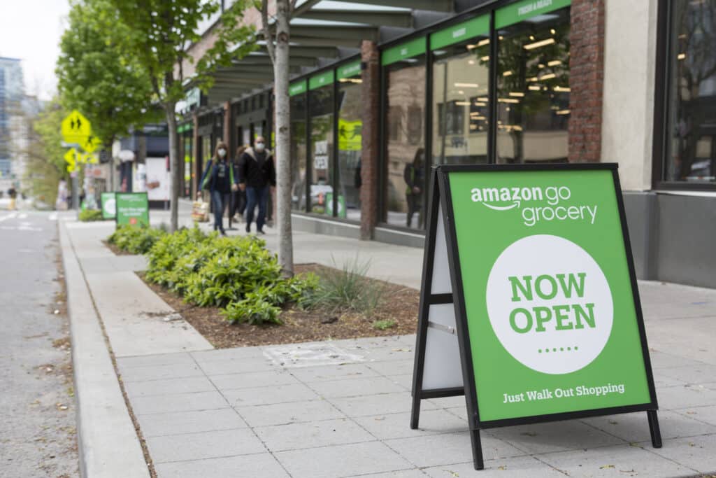
In an era dominated by digital advertising, the classic sandwich board continues to thrive as a preferred marketing tool among small retail businesses across North America. Known for their affordability, practicality, and effectiveness, sandwich boards, or A-Frames, hold an invaluable position in the retailers’ advertising toolkit.
Advantages
Cost-Effectiveness
One of the foremost advantages of employing a sandwich board is its cost-efficiency. For a price comparable to a carton of cigarettes, these boards offer an advertising solution whose impact can rival that of more expensive storefront signs. This affordability makes sandwich boards an attractive option for small business owners.
Durability and Practicality
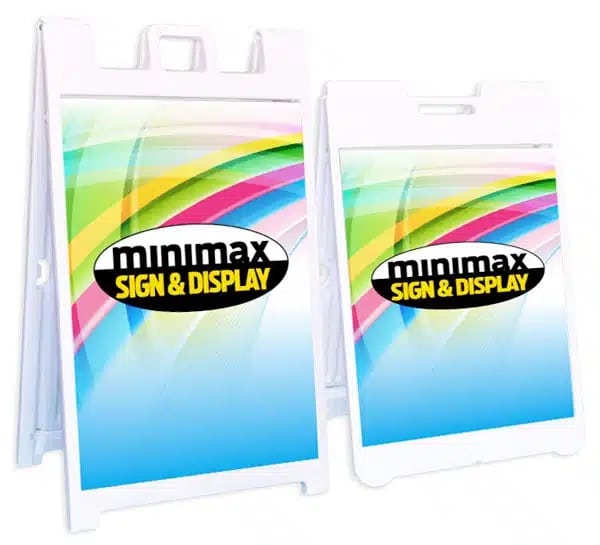
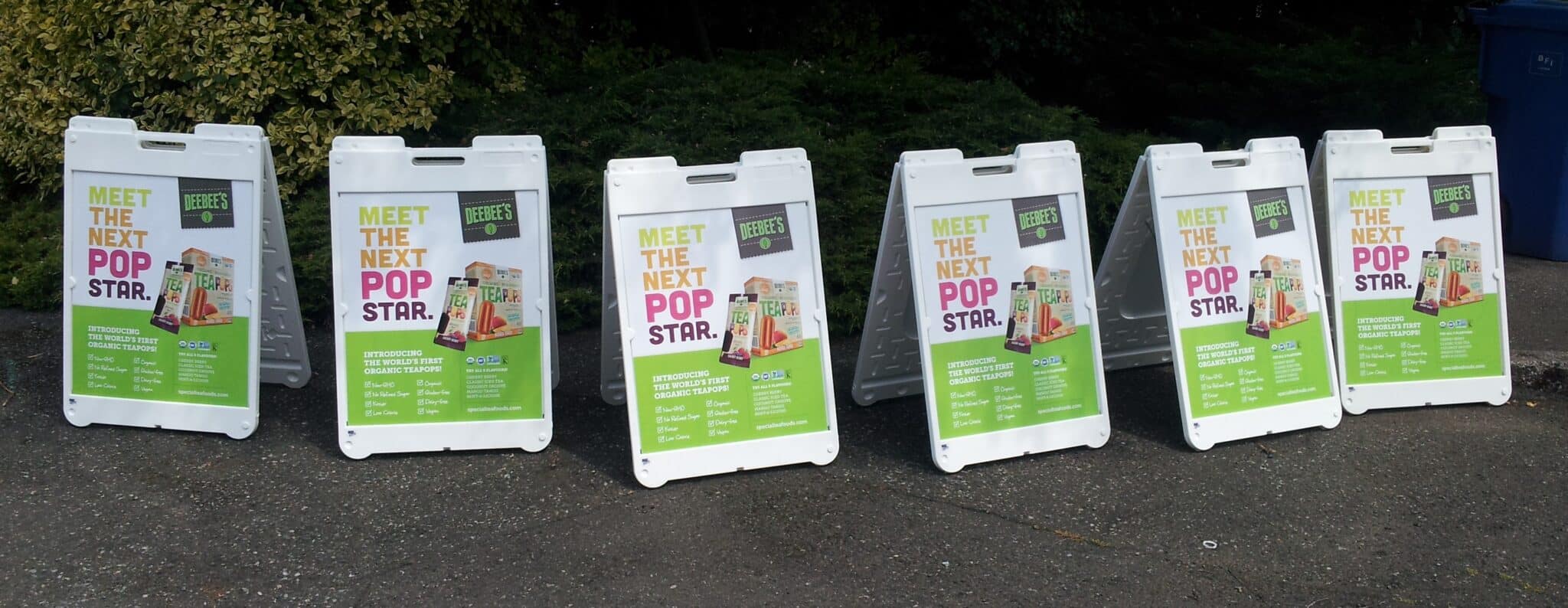
Modern sandwich boards are crafted from extruded plastic compounds which offer durability without the downsides of previous materials like plywood or metal. These modern versions are resistant to peeling, warping, splitting, swelling, rusting, and they don’t develop splinters, ensuring they last longer while being safer to handle and transport. Additionally, their design often includes changeable graphic panel inserts made from corrugated plastic sheets, allowing for the effortless updating of the business’s messaging.
High Visibility and Effectiveness
Despite their simplicity, sandwich boards excel in visibility and effectiveness. Placed strategically, they can catch the attention of both vehicular and pedestrian traffic from either direction. With options to display on both sides, these boards efficiently convey essential information like business hours, special promotions, or open/closed status. Their portability further enhances their utility, enabling businesses to easily relocate the advertising as needed.
Portability
Unique among advertising solutions, the sandwich board’s portability is unmatched. Lightweight and easy to carry, they can be quickly relocated to different sites, making them ideal for temporary events or changing business needs. This flexibility ensures that your marketing efforts are not confined to a single location.
Downsides
The primary disadvantage of sandwich boards lies in the risk of theft if not secured properly, an ironic testament to their value. Their utility and portability can, unfortunately, make them attractive targets for theft, underscoring the importance of bringing them indoors when not in use.
Customization Options for Sandwich Boards
When it comes to designing a sandwich board that truly stands out, personalization is key. Sandwich boards, A-frames, and sidewalk signs offer a wide canvas for creativity, allowing you to tailor them to your business’s unique needs and aesthetic. Here’s a closer look at the customization options that can elevate your portable sign:
- Material Choices: Depending on your specific needs, you can choose from materials like plywood (crezone) for a rustic, durable feel, aluminum for lightweight durability, PVC for weather resistance and vivid prints, or plastic for affordability and versatility.
- Functional Features: Enhance the usability of your sandwich board with features such as hinged message holders for easy updates, wheels for effortless mobility, dry erase or magnetic surfaces for dynamic message changes, handles for comfortable carrying, and weights to secure your board in windy conditions.
- Size and Shape: Sandwich boards come in various configurations and sizes, from compact models suitable for narrow sidewalks to larger options that offer greater visibility. Pick a shape and size that aligns with your message and the space available.
- Graphic Design: Utilize full-color printing to make your visuals pop, or opt for simple, high-contrast designs for clear messaging. Remember, your board should reflect your brand’s style and capture the attention of passersby.
Now, let’s delve into some best practices for designing your sandwich board, ensuring your message is both seen and remembered.
Best Practices for Designing Your Sandwich Board
Creating an effective sandwich board involves more than just writing your message in big letters. Here are some guidelines to ensure your design grabs attention and conveys your message:
- Keep It Simple: A cluttered design can be overwhelming. Stick to one main message or offer, and use a clean, readable font. Your goal is to communicate quickly and clearly to people on the move.
- Use Bold, Readable Fonts: Choose fonts that are easy to read from a distance. Avoid overly decorative fonts for the main message. Bold, sans-serif fonts usually work best.
- Contrast is Key: High-contrast color combinations, such as black on white or yellow on blue, make your sign more legible from afar. The greater the contrast, the more your message will stand out.
- Visible From Both Sides: If your sandwich board is double-sided, make sure your message is visible and appealing from both directions. This doubles your chances of catching someone’s attention.
- Include a Call-to-Action: Guide your audience on what to do next. Whether it’s “Visit us today,” “Follow us on Instagram,” or “Sale ends soon,” a clear call-to-action prompts immediate response.
- Pay Attention to Branding: Ensure your sandwich board aligns with your brand’s colors, fonts, and overall vibe. Consistent branding helps build recognition and trust among your target audience.
By selecting the right customization options and following these design best practices, your sandwich board will not only capture attention but also effectively communicate your message, drawing more customers to your business.
Sandwich boards remain a steadfast and effective marketing tool for small retail businesses. Their affordability, durability, visibility, and portability make them an essential component of any business’s advertising strategy. Despite the minor concern of potential theft, the sandwich board’s benefits far outweigh its drawbacks, solidifying its status as an indispensable tool in the retail marketing arsenal.


